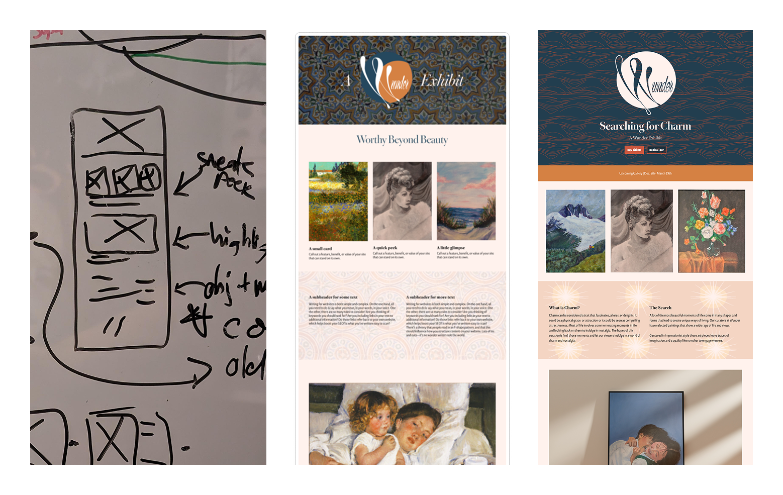
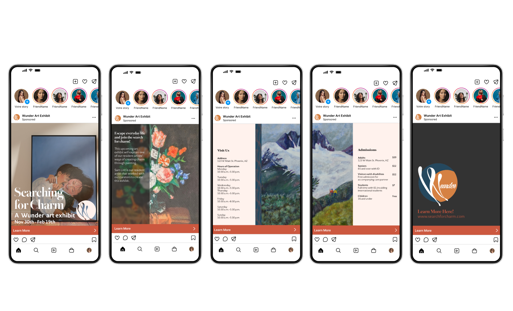
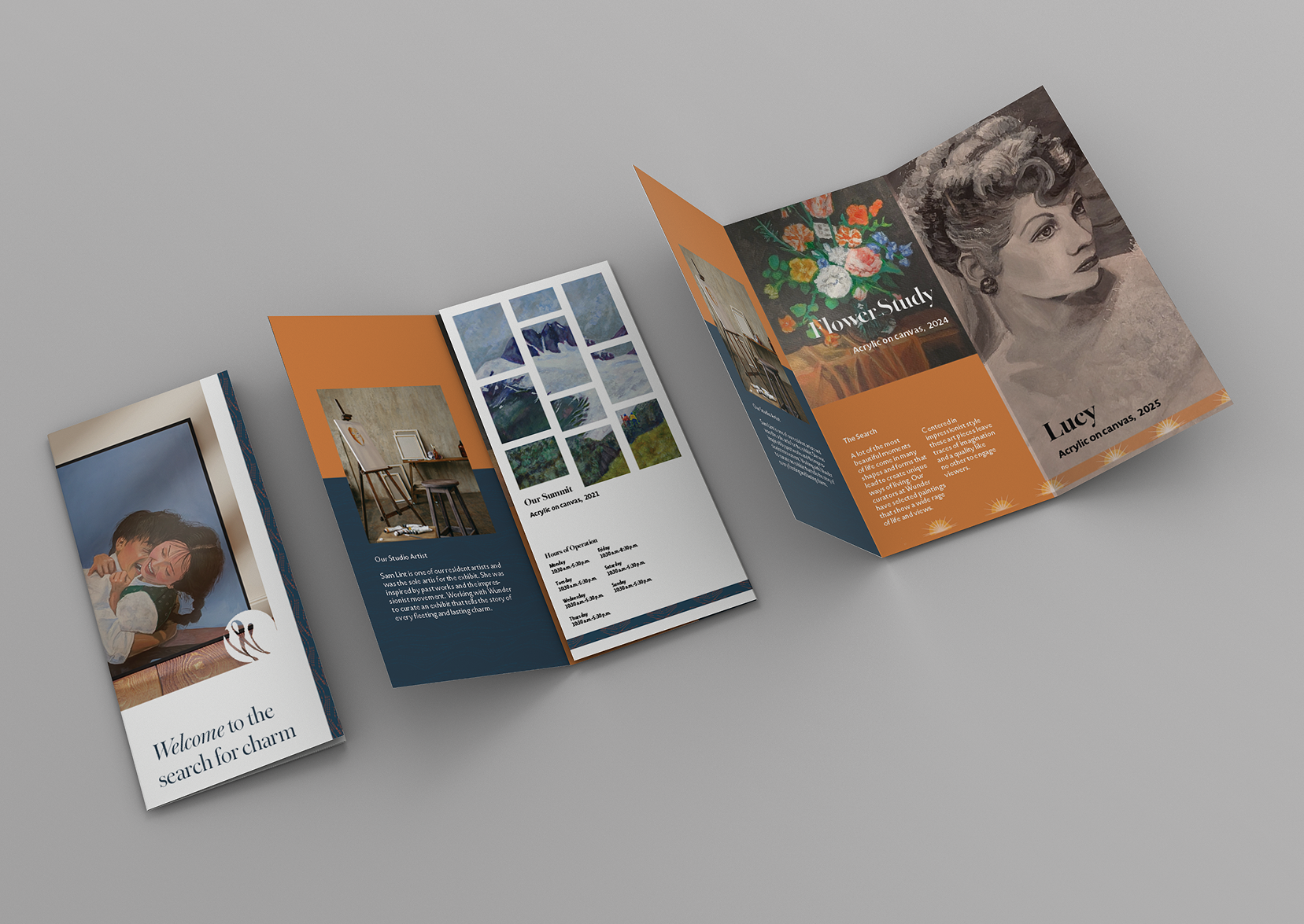
I delivered a complete brand identity and cross-platform campaign for an upcoming exhibit. The user journey begins with social media content designed to capture attention and build intrigue, guides users to a website with detailed exhibit information, and concludes with print materials that enhance the in-person gallery experience.I delivered a clickable prototype demonstrating core user flows: account creation and sign-in, ticket purchasing, event browsing with filtering capabilities, and detailed event pages. The prototype successfully validated the design approach and provided Mood with a clear roadmap for development.
Through this project, I discovered how critical it is to design each touchpoint with a specific purpose rather than treating them as interchangeable brand extensions. Social media needed to spark curiosity with just enough information to intrigue. The website served as the research phase where users could dive deeper and commit to attending. Print collateral became crucial for creating that tangible "cabinet of wonders" feeling once visitors arrived. This taught me to think more strategically about where users are mentally at each stage and what they actually need at that moment.
Next steps: The current campaign focuses on launching a single exhibit. The natural evolution would be to develop a flexible brand system that could adapt to multiple gallery programs throughout the year: rotating exhibitions, artist talks, workshops, and community events. I'd also want to gather visitor feedback after the first exhibit launch to understand which touchpoints resonated most, then refine the approach for subsequent programming.
Results and Lessons
This prototype was a learning experience in meeting user where they are at.

.png)
.png)