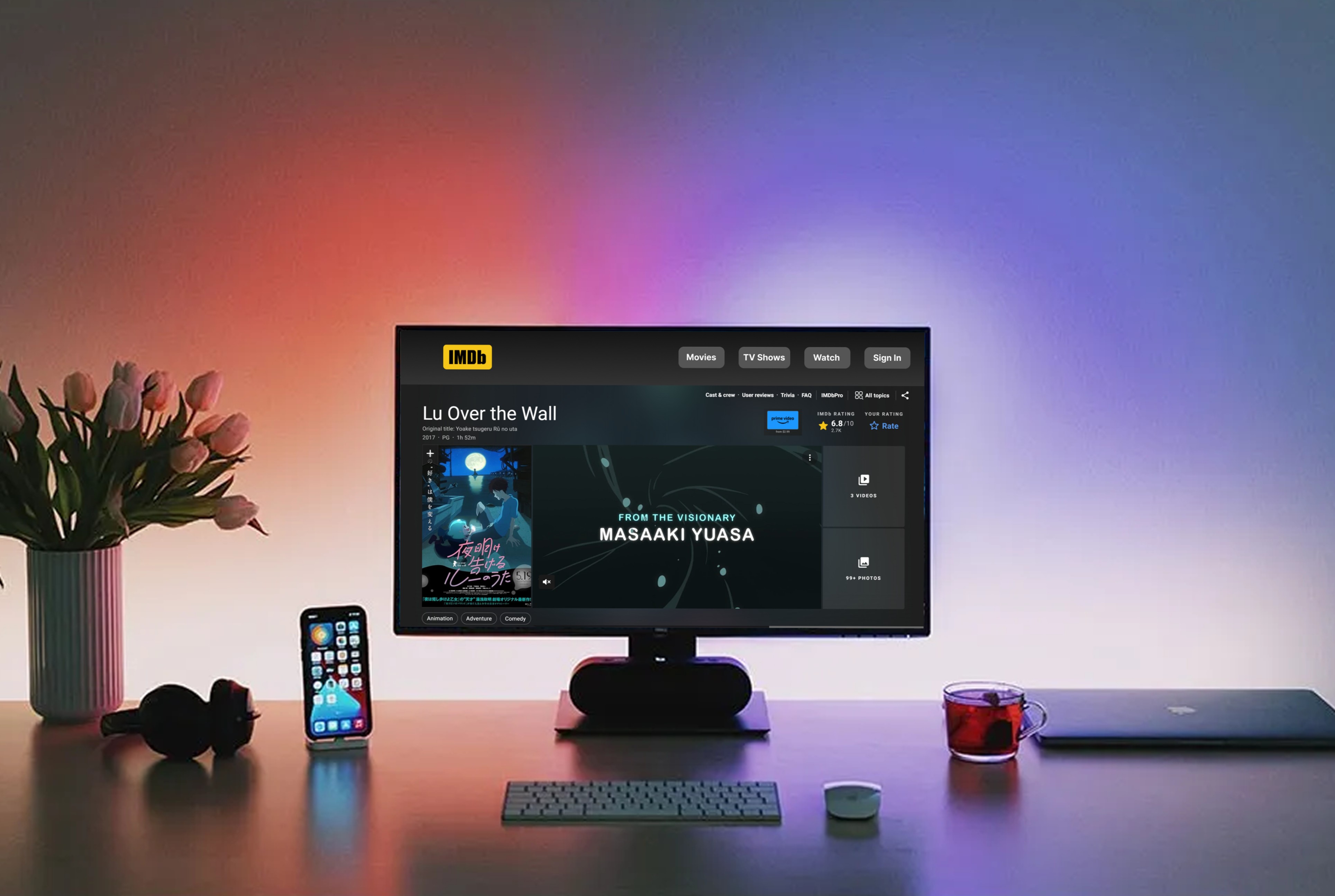
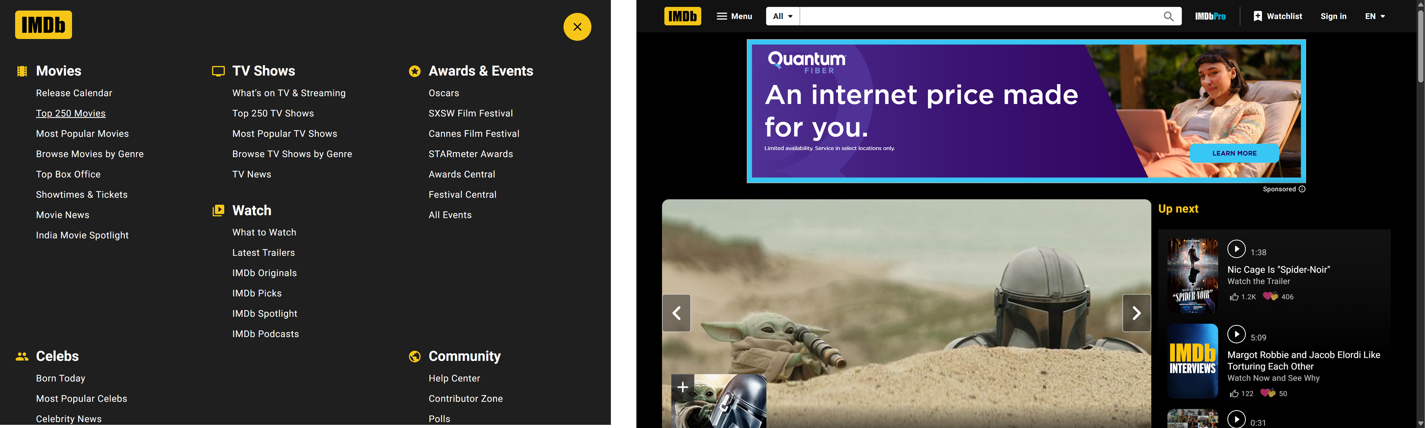
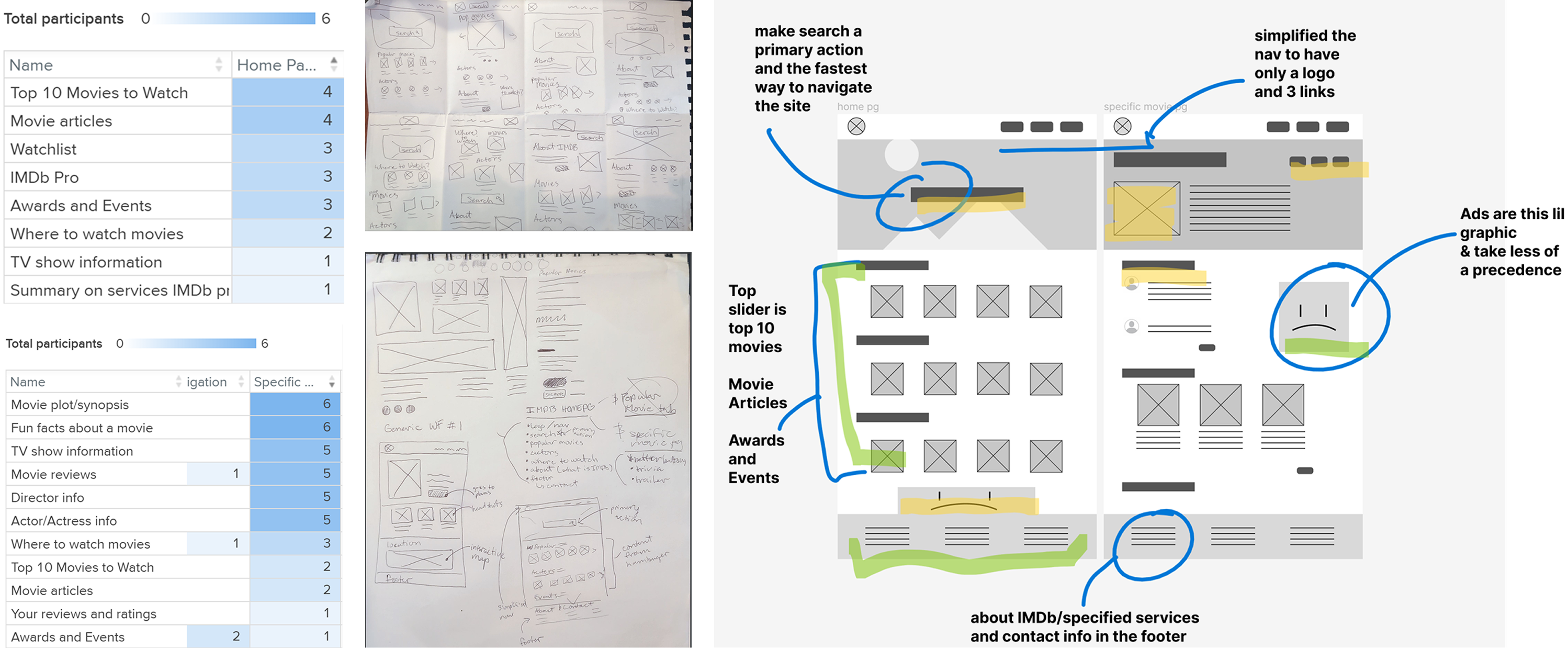
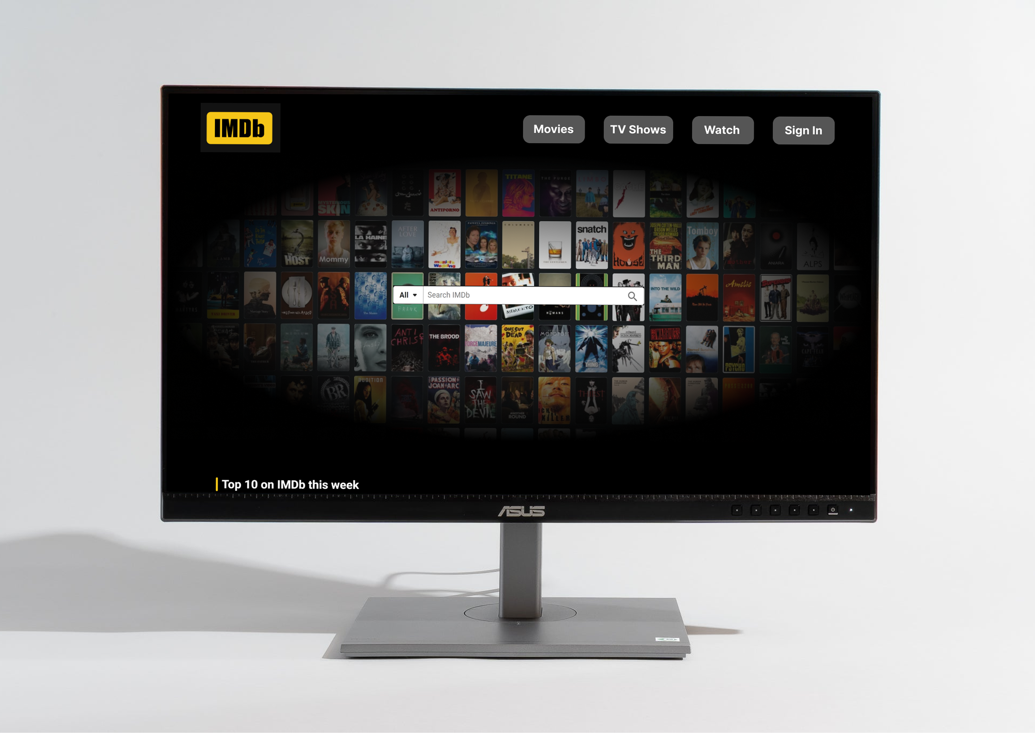
I delivered a redesigned experience with three major improvements: a streamlined navigation system with clearer hierarchy, a reimagined homepage with focused purpose, and redesigned movie pages that surface key information faster. The new navigation structure reduced cognitive load by simplifying menu options. The homepage now guides users toward discovery rather than overwhelming them. Movie pages were reorganized so users can answer their questions "Is this worth watching?" and "Where can I watch it?" in seconds rather than minutes.
Through user testing, I found that more information doesn't always help users make better decisions, it often paralyzes them. The users I interviewed wanted quick access to ratings, where to watch, and a general vibe check, not an encyclopedia entry. This taught me to prioritize user needs and trust that users will dig deeper if they want to, but they need the essentials upfront first.
Next steps: The current redesign focuses on the movie discovery and decision-making journey. A full implementation would expand to include personalized recommendations based on viewing history, social features for sharing watchlists with friends, and refined filtering that learns from user behavior over time.
Results and Lessons
Creating a new way to experience IMDb.